Most of your subscribers will open your emails on a phone, so getting the mobile experience right matters. Instant gives you control over how multi-column content behaves on smaller screens through the Stack on mobile setting on Layout blocks.
What Stack on mobile does
Stack on mobile is a per-block setting on any Layout block. It controls how the columns inside that Layout render on mobile devices, without changing the desktop view.
- Off (default): Columns stay next to each other on mobile, matching the desktop layout.
- On: Columns automatically stack vertically on mobile, so each item takes the full width of the screen.
When to stack and when not to stack
We typically recommend turning Stack on mobile on for grids of product images. Stacked product images are larger, easier to tap, and better suited to the way people scroll on a phone.
We recommend turning Stack on mobile off when the composition of the Layout is part of the design and you want it to look the same on web and mobile. Common cases:
- Designed image grids where the arrangement carries the meaning
- Icon rows or feature strips where horizontal alignment matters
- Footer navigation links
How to toggle Stack on mobile
- Open the campaign or flow email you want to edit.
- Click the Layout block you want to adjust.
- In the left panel, find the Stack on mobile toggle.
- Switch it On to auto-stack on mobile, or leave it Off to keep columns side by side.
- Save your changes.
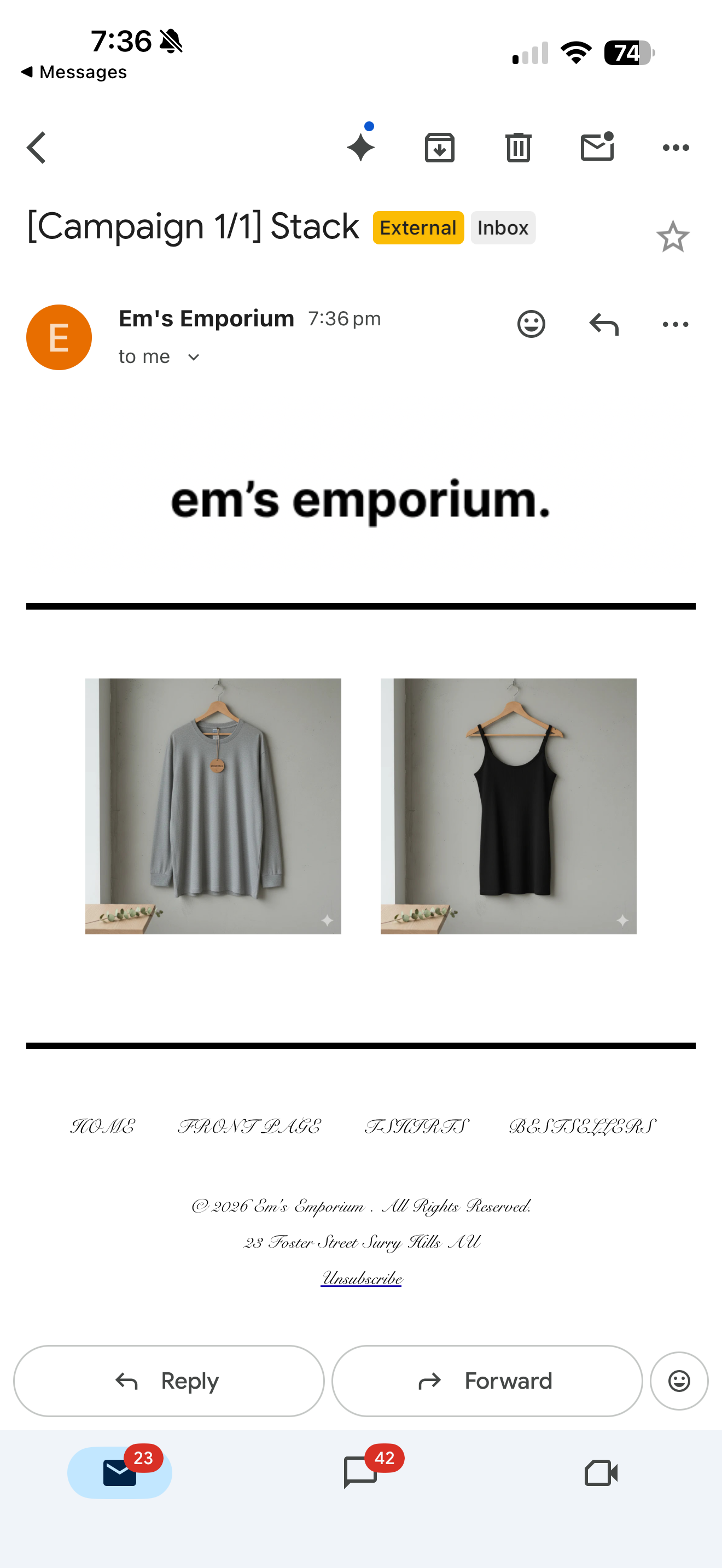
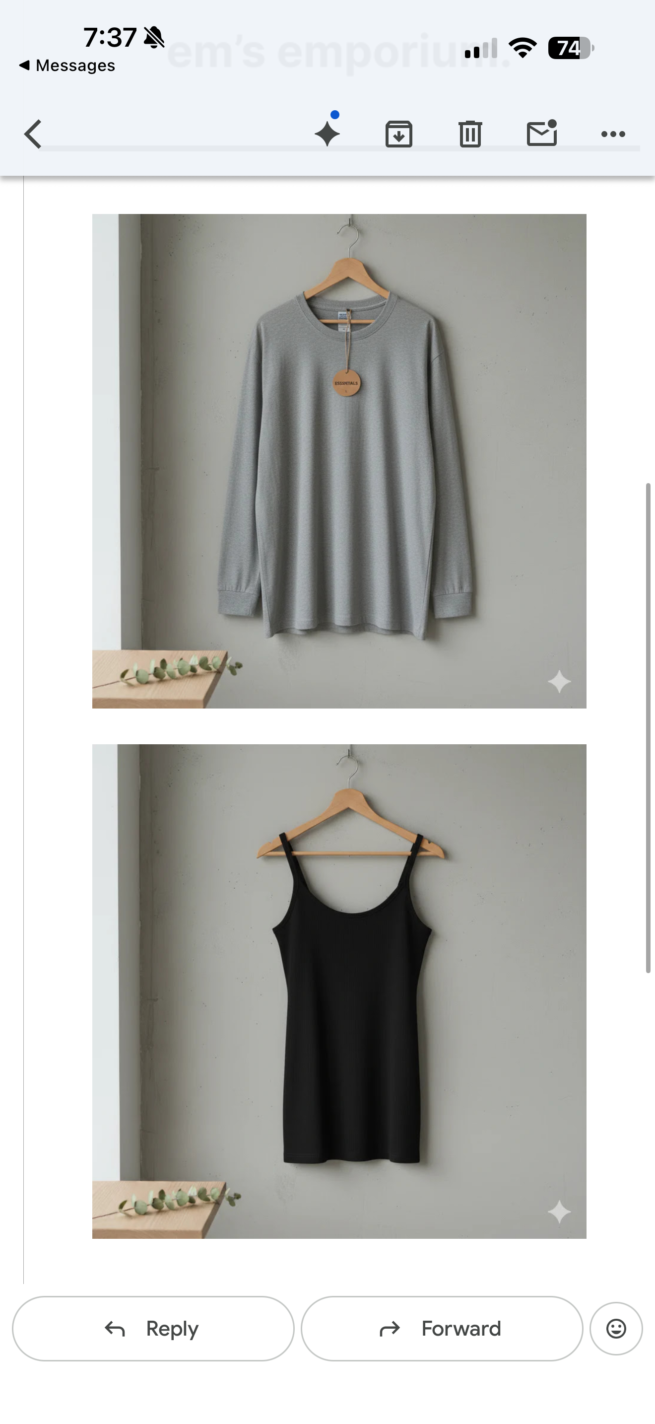
Examples of a Layout Block with no stacking (left) or with stacking (right)
FAQ
Does this setting apply to every block? No. Stack on mobile is a setting on Layout blocks only.
What is the default? Off. Columns stay next to each other on mobile unless you turn the toggle on.
Can I use different settings on different Layout blocks in the same email? Yes. The setting is per Layout block, so you can stack a product grid and keep a feature row side by side in the same email.
Will my desktop view change if I turn it on? No. Stack on mobile only affects how the Layout renders on mobile.